Overview
What we delivered
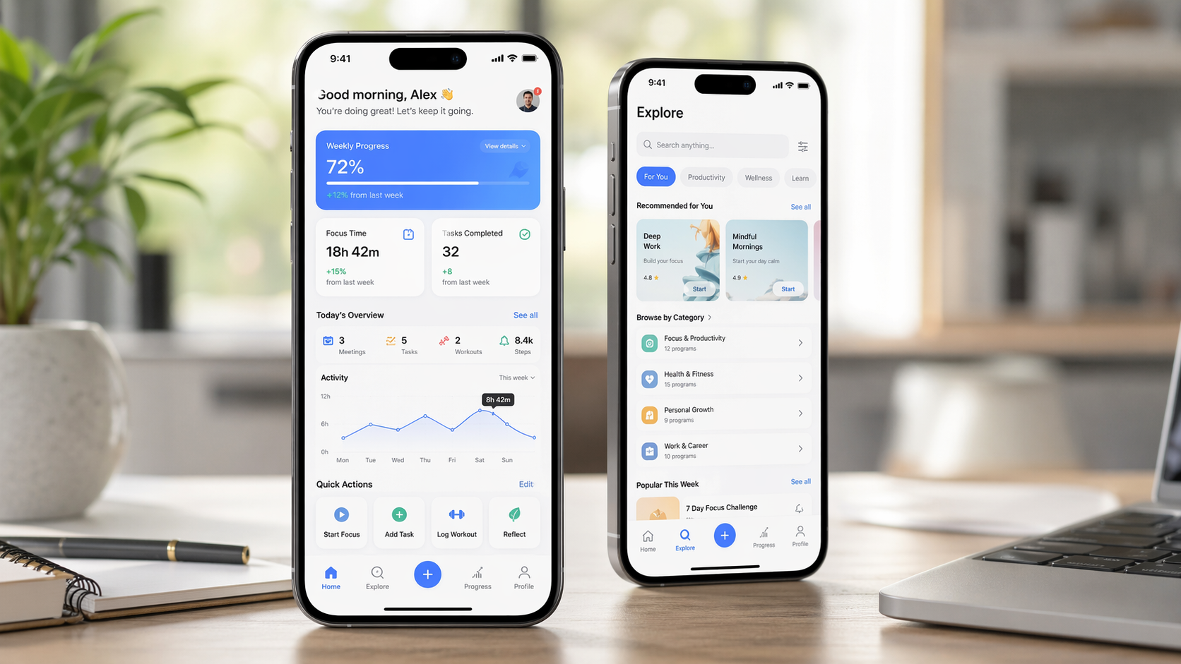
A mobile app was struggling with low engagement and needed a clearer, more intuitive experience to keep users active for longer. The navigation structure was not helping users discover value efficiently, and the dashboard experience was not engaging enough to support repeat use. Stellar Code System redesigned the app UX to improve usability, session depth, and overall engagement.
Client
A mobile-first digital product looking to improve user engagement, session quality, and in-app navigation clarity.
Challenge
The app experience was not retaining user attention effectively. Navigation felt weak, the dashboard lacked a clear hierarchy, and users were not spending enough time inside the product.
Low app engagement
Weak navigation UX
Dashboard experience not driving enough activity
Low session depth and repeat interaction
Solution
Stellar Code System redesigned the mobile app experience to improve user flow, simplify navigation, and make the dashboard more useful and engaging.
1. Navigation UX Improvement
Improved navigation UX across key app journeys
Made user movement between sections more intuitive
Reduced confusion in finding important actions
Helped users discover more value inside the product
2. Dashboard Redesign
Redesigned the dashboard experience
Improved content hierarchy and action visibility
Made the home experience more useful and engaging
Created a stronger first-touch product experience
3. Engagement-Focused UX Refinement
Improved overall usability and interaction flow
Supported deeper session engagement
Made the product feel easier to use consistently
Strengthened the app experience for repeat visits
Technology Stack
UX Focus: Mobile app UX redesign for engagement and usability improvement
Navigation Strategy: Clearer navigation architecture and in-app movement refinement
Dashboard Optimization: Home screen and dashboard experience redesign for stronger action flow
Implementation Timeline
Phase 1 (Week 1): App UX audit, engagement analysis, navigation pain-point review
Phase 2 (Weeks 2-3): Navigation redesign, dashboard restructuring, UX flow improvement
Phase 3 (Weeks 4-5): Testing, rollout, and engagement performance tracking
Results
The mobile UX redesign improved how users move through the app and increased the time and attention they spend within the product.
Key Metrics:
+70% session time
+48% user engagement
Business Impact:
Improved app usability and navigation clarity
Increased user activity inside the product
Strengthened the dashboard as a core engagement surface
Created a better foundation for long-term product retention
Client Testimonial
Words from the client
The redesign made a clear difference in how users interact with our app. Navigation is easier, the dashboard is more useful, and users are spending much more time engaging with the product.
Technical Highlights
Mobile navigation UX redesign
Dashboard experience overhaul
Engagement-focused UX refinement
Improved session depth
Better in-app usability
Retention-oriented mobile product design
Future Enhancements
The app is now prepared for deeper product engagement and personalization improvements.
Personalized dashboard modules
Behavior-based navigation shortcuts
In-app onboarding and tips
Engagement experiments and A/B testing
Deeper retention and lifecycle UX flows
Previous case study
E-commerce UX Improvement for Checkout Conversion and Cart Recovery
E-commerce UX Design
Next case study
DevOps Transformation for a FinTech Platform
FinTech DevOps
Let’s build yours
Want similar results for your business?
Share your requirements—we’ll propose a premium, scalable solution.